gg_politicalcompass(data = data,
top = "good",
bottom = "evil",
left = "chaotic",
right = "lawful"
)ggmemes
news
code
analysis
A package for creating political compass charts with ggplot
Introduction to ggmemes
Automated art for the 21st century
Author: Ethan Milne, PhD Student (Marketing/Consumer Behavior), Ivey Business School
Purpose: Personal amusement
Political Compass Format
Suppose you have a dataframe df, and want to create a political compass based on it. With gg_politicalcompass(), doing this can be done in only a couple lines of code. First, you need to initialize a ggplot object, shown below:
gg_politicalcompass(data = df)This results in the following output: 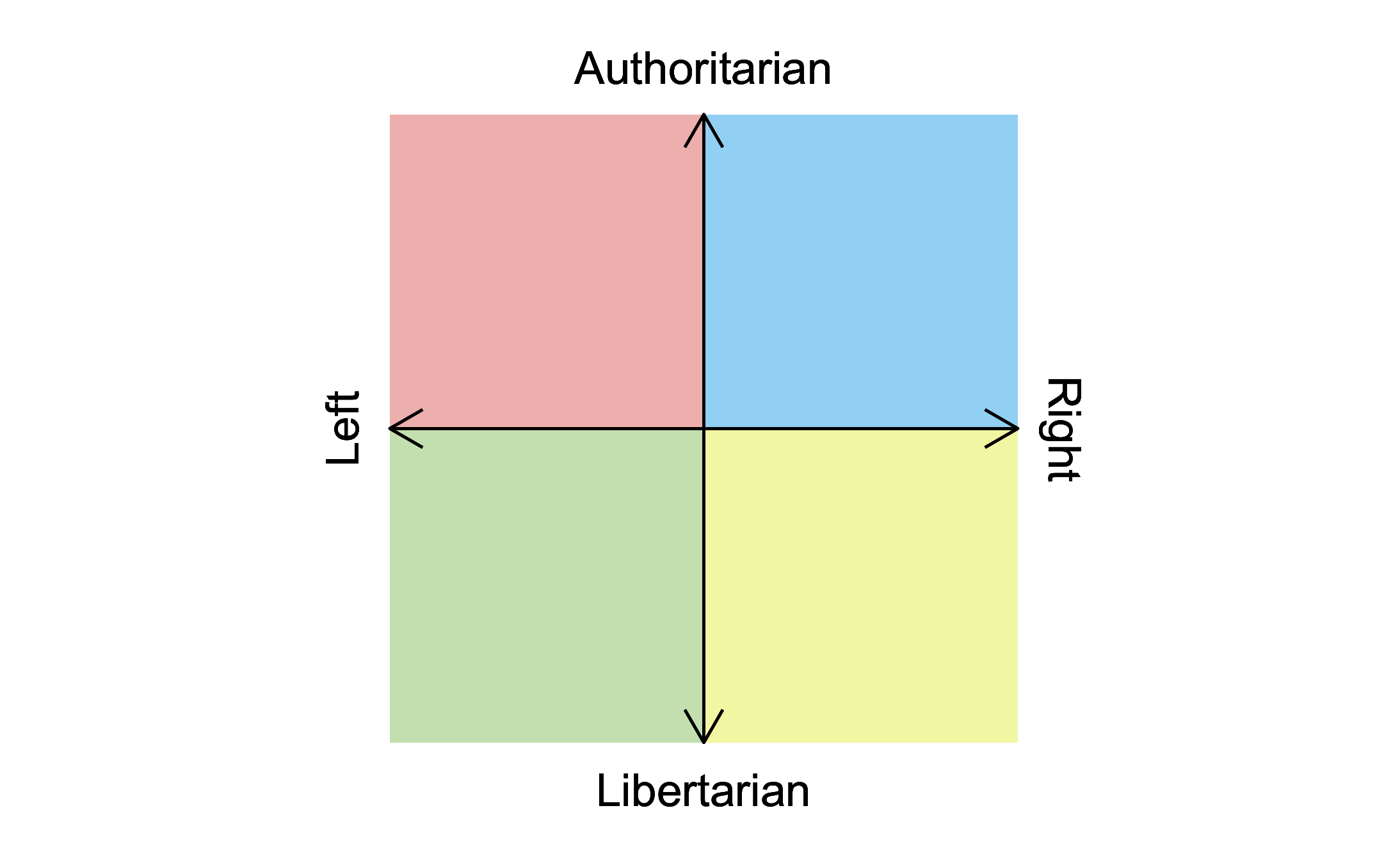
To add data to this plot, you can use the pre-existing ggplot function, geom_point:
gg_politicalcompass(data = data) +
  geom_point(aes(x = x,
                 y = y,
                 size = value))
This results in the following output: 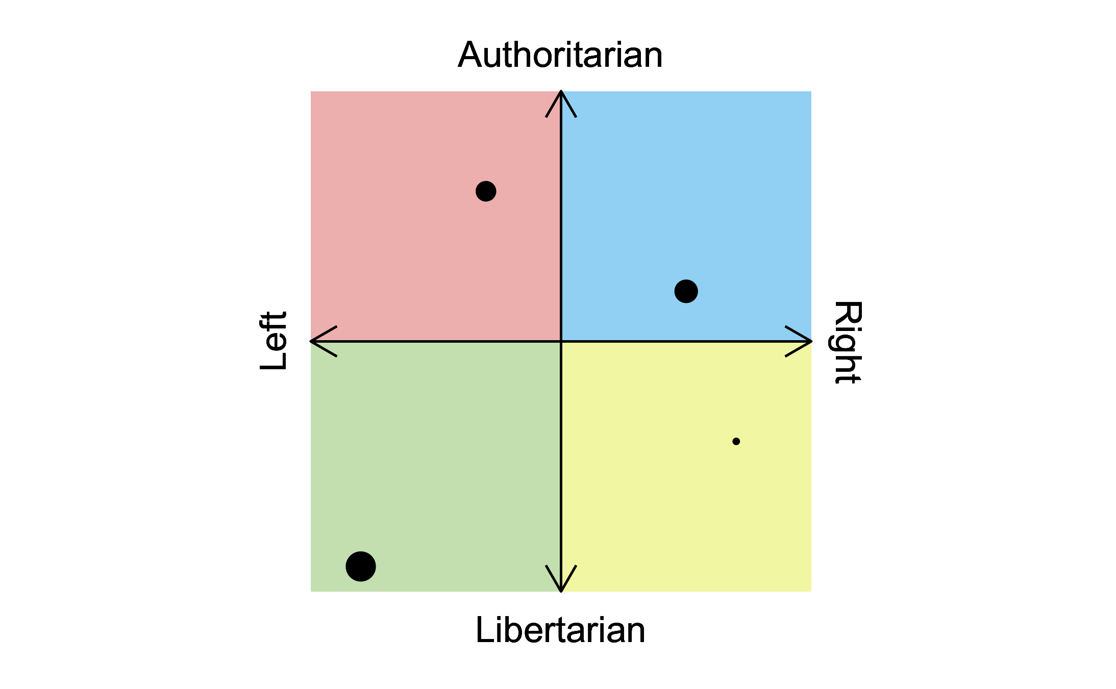
Labels can be changed with the optional parameters “top”, “bottom”, “left”, and “right” within the function call. For example:
Installation
You can install ggmemes with the following code:
devtools::install_github("SEthanMilne/ggmemes")── R CMD build ─────────────────────────────────────────────────────────────────
* checking for file ‘/private/var/folders/b0/fl0x4rgd3rb4qhdlh7n52sk80000gn/T/RtmpoA6XXM/remotes62c1198088c6/SEthanMilne-ggmemes-ce31423/DESCRIPTION’ ... OK
* preparing ‘ggmemes’:
* checking DESCRIPTION meta-information ... OK
* checking for LF line-endings in source and make files and shell scripts
* checking for empty or unneeded directories
Omitted ‘LazyData’ from DESCRIPTION
* building ‘ggmemes_0.1.0.tar.gz’Citation
I’m sure this will be used in many peer-reviewed publications. To that end, the citation for ggmemes can be found below:
To cite package ‘ggmemes’ in publications use:

  Ethan Milne (2022). ggmemes. R package version
  0.1.0.

A BibTeX entry for LaTeX users is

  @Manual{,
    title = {ggmemes},
    author = {Ethan Milne},
    year = {2022},
    note = {R package version 0.1.0},
  }